
BEC “You Need BRAND’S”
From Occasion to Habit
BRAND’S Essence of Chicken
Art Director
Launched in market
ROLE
CLIENT
OUTCOME
A behaviour-change campaign designed to shift BRAND’S Essence of Chicken from an occasional tonic into a more relevant daily supplement habit for young working adults.
THE BRIEF
In Malaysia, BRAND’S Essence of Chicken was often consumed reactively - during illness, exam periods, or moments of fatigue - rather than as part of a consistent daily routine.
The challenge was to reposition the product for a younger working audience and build a more proactive habit around everyday use, while still reinforcing three key product benefits: Better Concentration, Extra Boost, and Think Smarter.
THE IDEA
The campaign was built around the platform You Need BRAND’S.
Instead of presenting the product as something people reach for only when necessary, the idea reframed it as a more proactive daily supplement - a small but consistent advantage for staying sharp, focused, and energised. This gave the brand a clearer role in everyday working life rather than only in high-stress or recovery moments.
PACKAGING SYSTEM
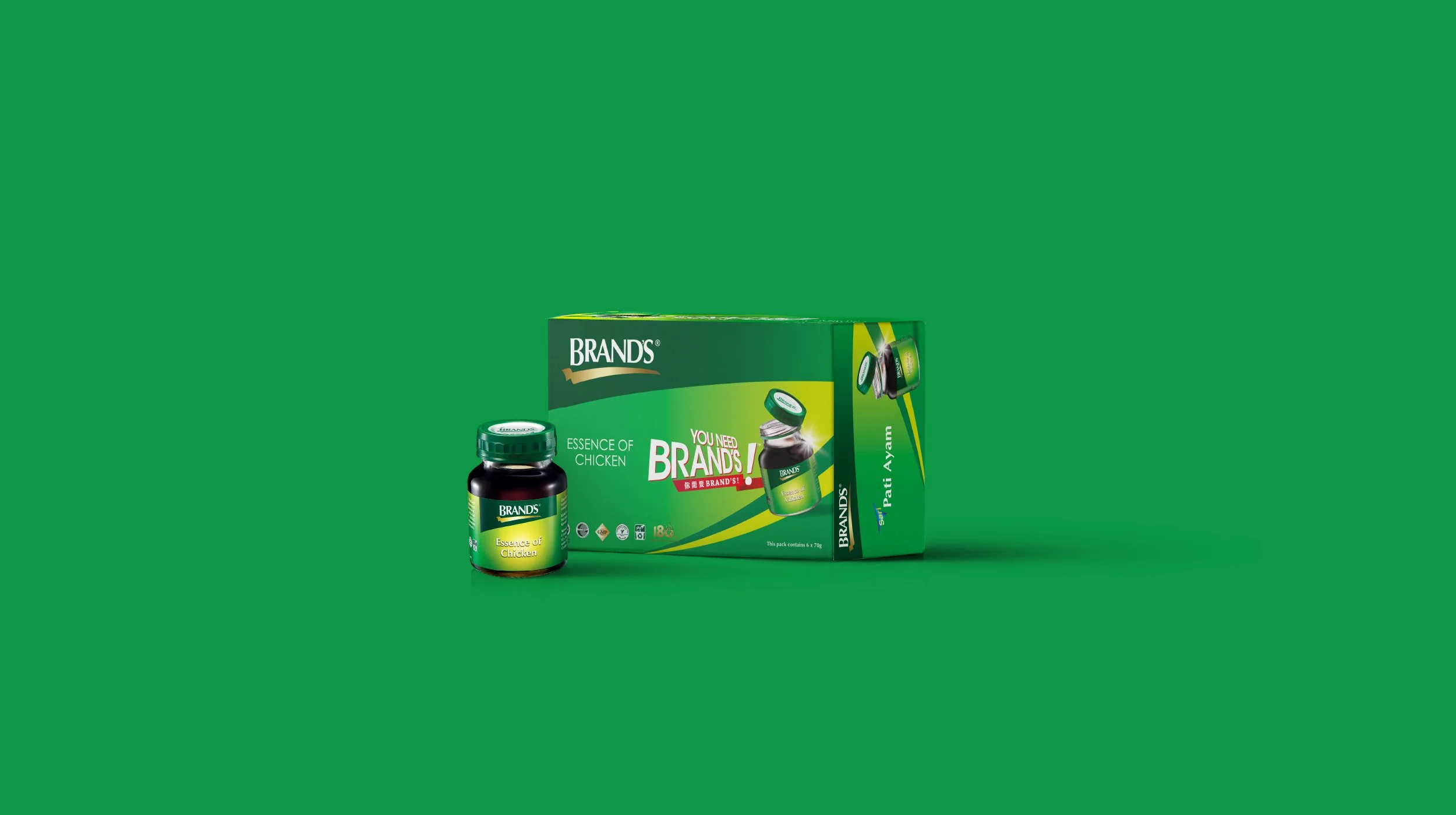
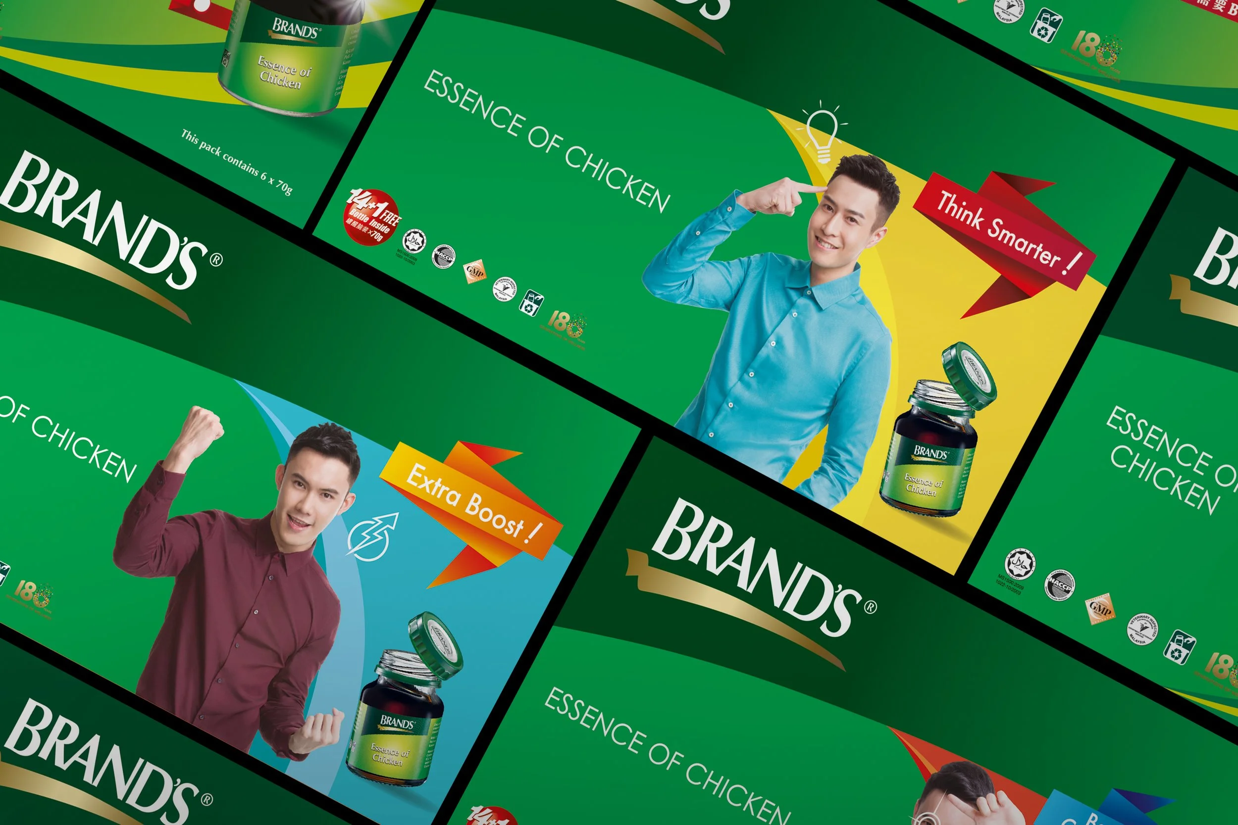
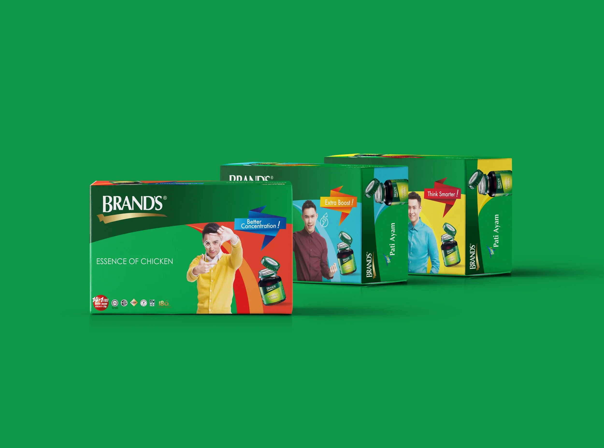
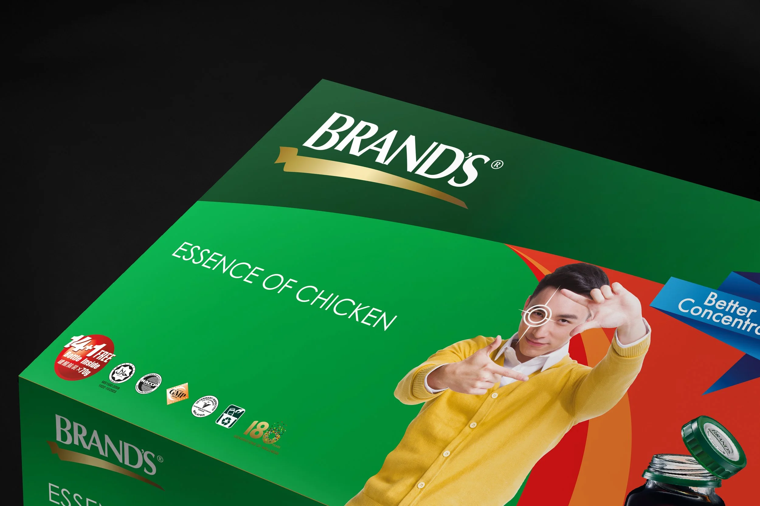
The packaging was redesigned around the three key benefit pillars - Better Concentration, Extra Boost, and Think Smarter - creating three visually distinct expressions of the same product.
Each variant used its own colour coding and talent persona, helping the product feel more contemporary, benefit-led, and relevant to younger professionals. A 14+1 format was also introduced as part of the wider move toward routine consumption, though the main campaign focus remained on the broader daily-use shift.
TVC + PHOTOSHOOT
The TVC translated the campaign into a more dramatic expression of everyday pressure.
Using the line "Forge ahead or be swept backwards," the film turned familiar workplace struggles into a visual metaphor for falling behind - physically reversing each character’s momentum before restoring it. Set against a stripped-back white environment with bold colour cues for each talent, the film gave the campaign a cleaner, more modern energy while reinforcing the three product benefits.
The accompanying photoshoot carried the same visual language into still imagery, using three young working adults to personify each benefit in a simple, recognisable way.
PRINT MATERIALS
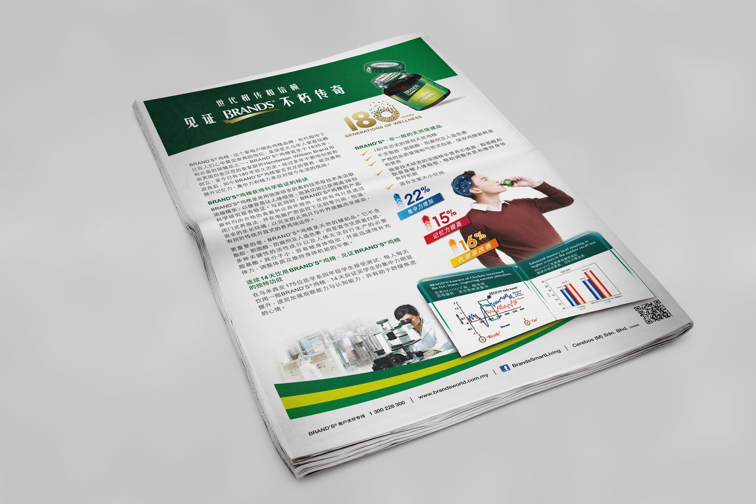
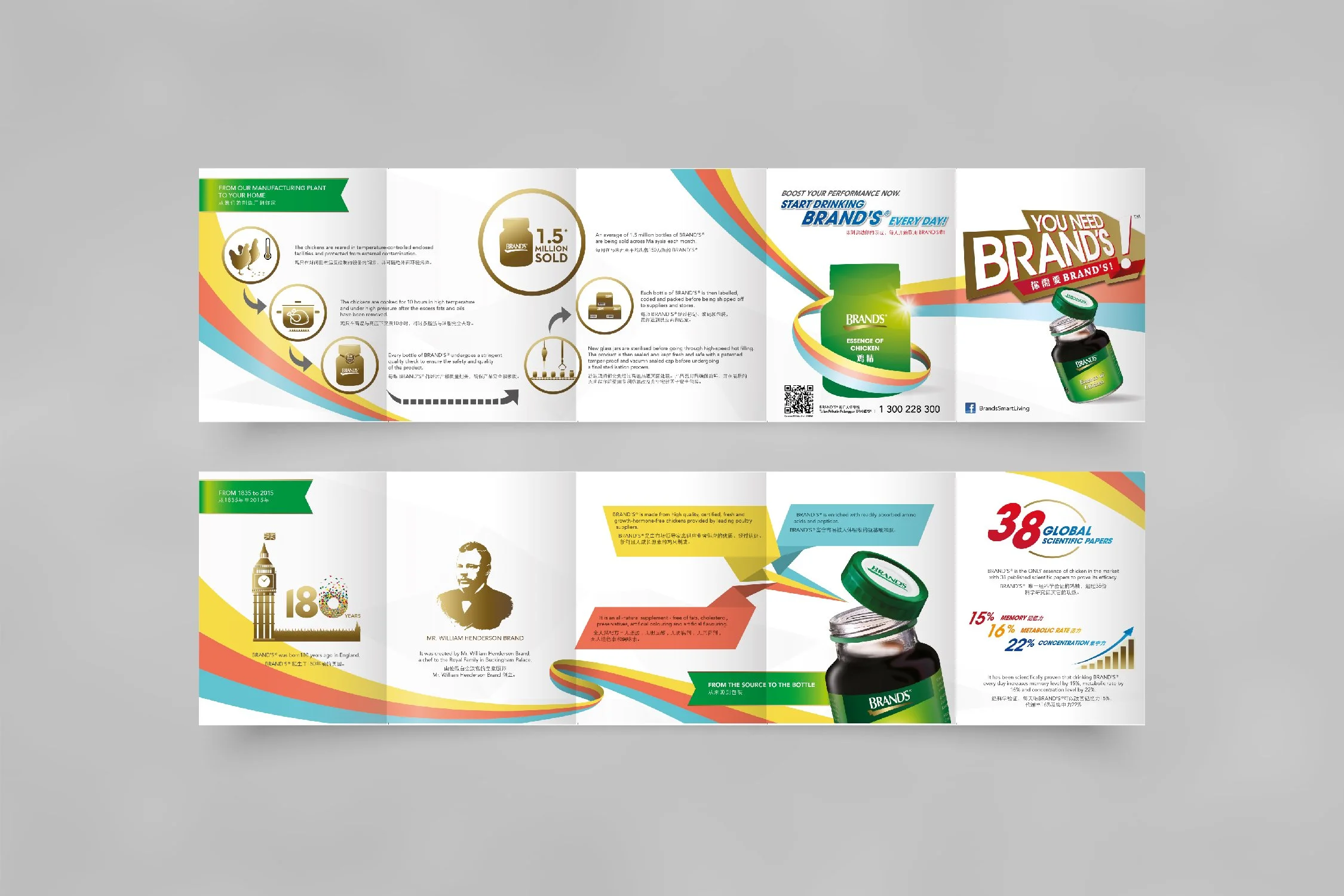
The campaign extended into print through pack-led editorial layouts and newspaper-style executions, helping the same message carry across product, film, and static communication.
The campaign launched in market and gave the brand a clearer, more contemporary direction for the year’s communication. Client-reported results included an 18.5% year-on-year sales uplift during the campaign period, alongside a 2.4x increase in multi-variant bundle sales.
OUTCOME
Positive Client Respons