
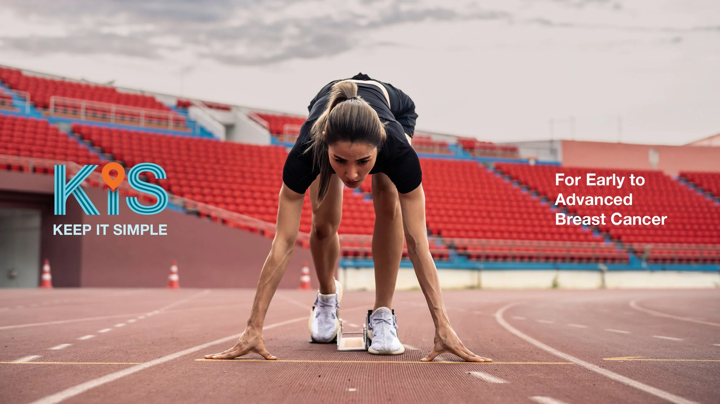
KISQALI "Keep It Simple"
New Indication Launch Event
OUTCOME
Pitch Won. Produced.
ROLE
CLIENT
Lead Art Director
Novartis Singapore
A pitch-winning launch identity for Kisqali's expansion from advanced to early breast cancer, built around one simple idea: one treatment across the patient journey.
THE BRIEF
Novartis invited us to pitch a launch event for Kisqali's new indication, expanding its use from advanced to early breast cancer. The challenge was to communicate that shift clearly to oncologists through an event identity that felt premium, focused, and easy to understand.
THE BIG IDEA
The creative unlock came from the name itself:
KIS in Kisqali became Keep It Simple.
That line gave us a clear strategic direction. Rather than emphasising treatment complexity, we framed Kisqali as one trusted therapy that could now support patients from early to advanced breast cancer.
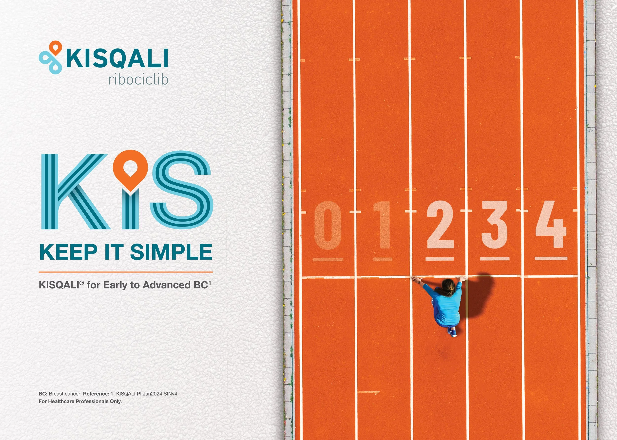
To bring that idea to life, we built the campaign around the visual language of a running track - linear, structured, and immediately understood as a journey, the journey of a cancer patient.
VISUAL SYSTEM
The identity drew from the geometry of a running track, using clean lines, open space, and a warm, grounded palette to express clarity and control.
The key visual translated the idea directly: lanes 2, 3, and 4 represented stages of breast cancer, with the subject positioned at lane 2 to emphasise Kisqali's earlier point of intervention.
LAUNCH FILM
With only one month from confirmation to production, the launch film was built from curated stock footage and unified through custom grading and motion treatment to create a cohesive campaign world without a live shoot.

IN VENUE
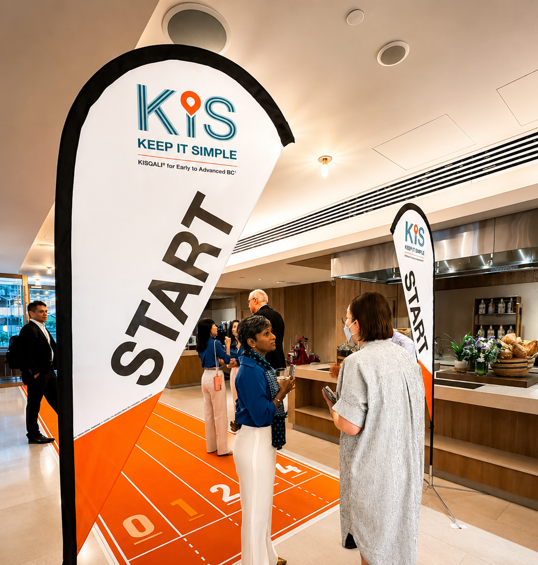
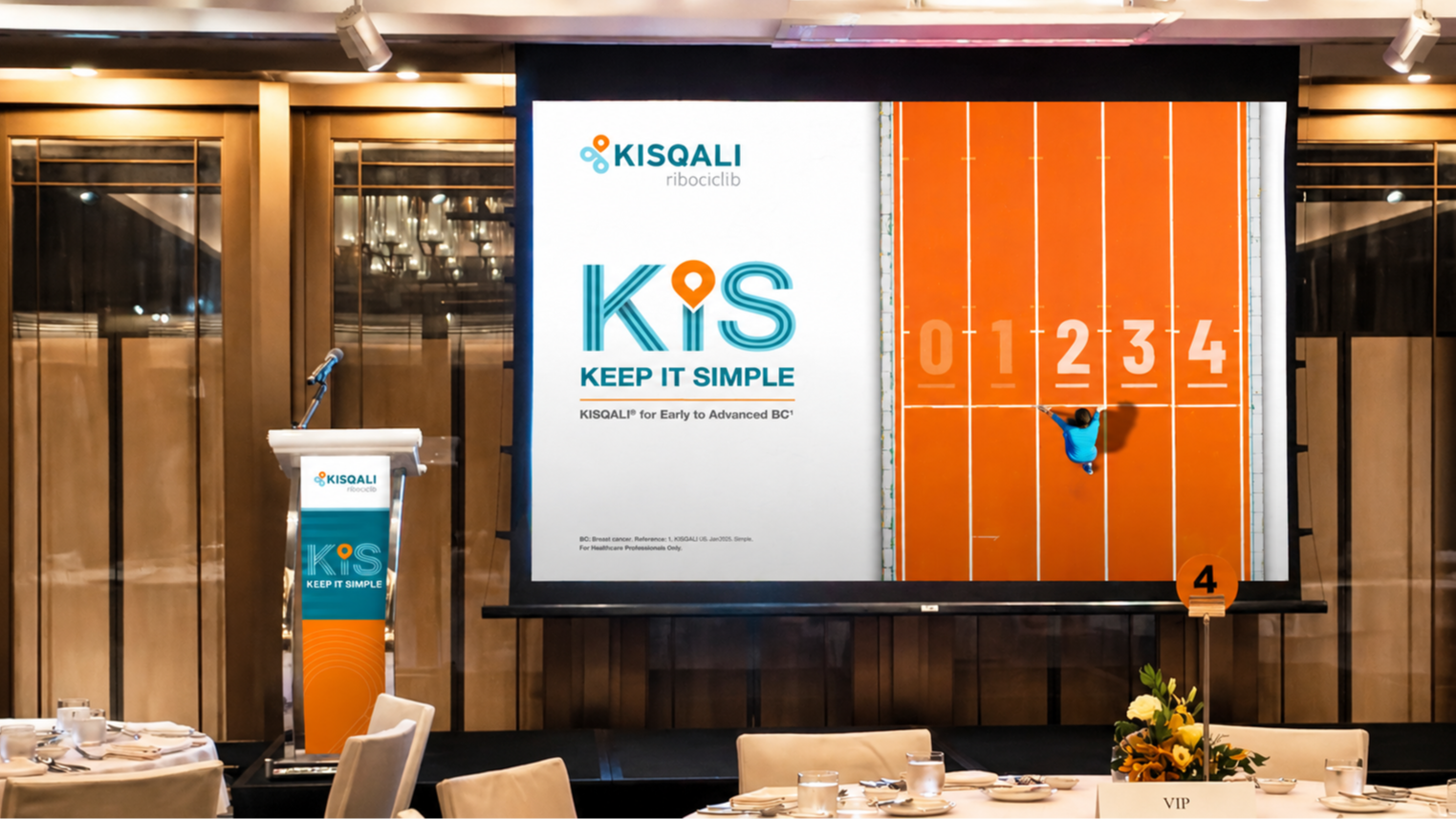
The system extended into the event space through entrance graphics, track-line carpeting, and stage applications across the podium and presentation backdrop. Minor adjustments were made during rollout to accommodate venue restrictions while preserving the core idea.

TOUCHPOINTS
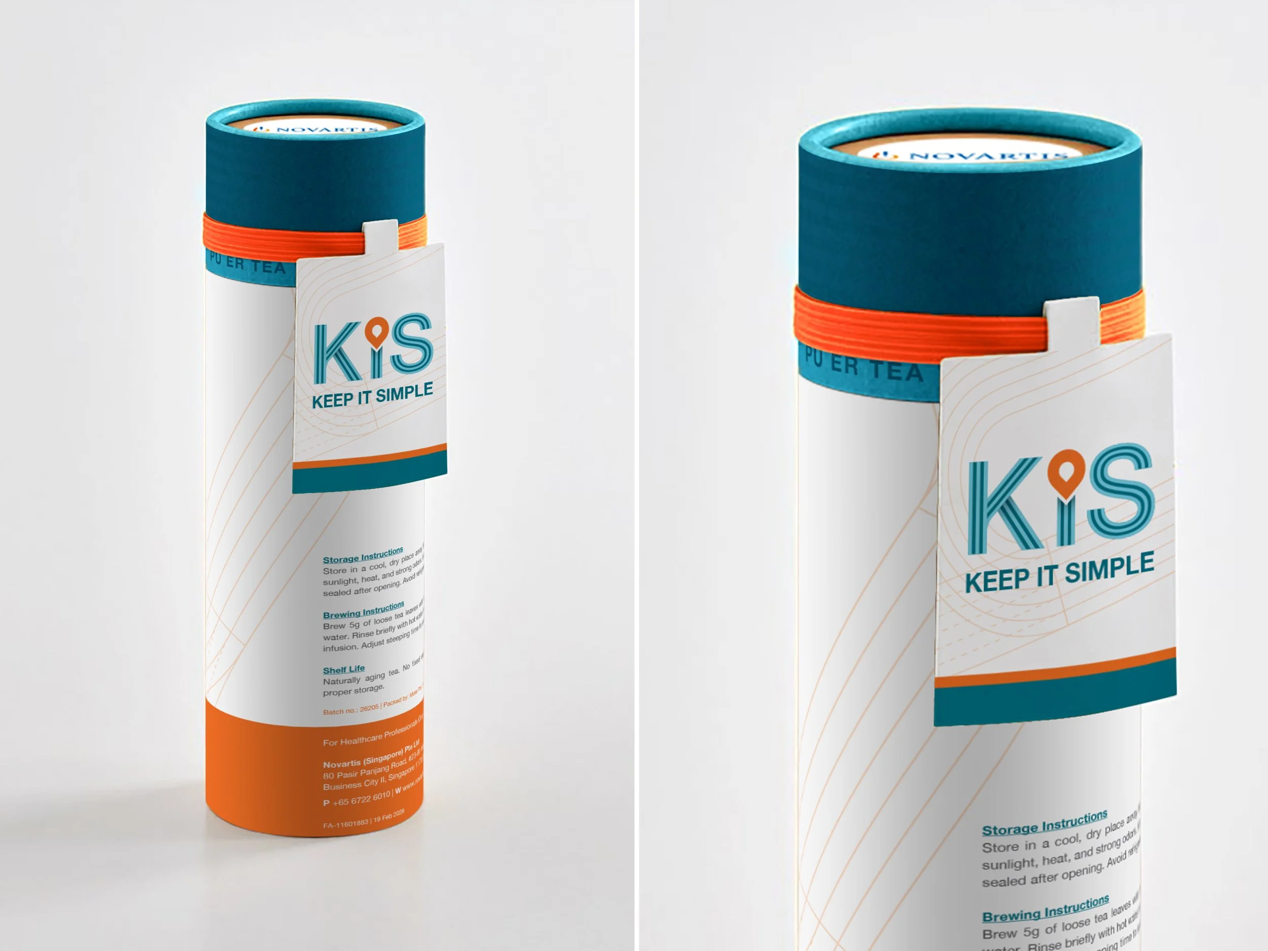
The identity extended into guest-facing details, including an invitation designed like a race bib and a tea gift inspired by a relay baton.
These pieces brought the running-track idea into tactile form and helped create a more memorable event experience without overcomplicating the system.
The concept won the competitive pitch and moved into full production, with minor changes made during rollout to suit venue requirements.
OUTCOME
Commercial Pitch Victory
What made the system effective was its clarity: one simple visual metaphor, applied consistently across motion, print, and space.
Flawless Asset Elasticity